Weekly Table Setting: Moody Hues and Neutral Accents
Lately, we have been sharing many summer-themed table settings, featuring some combination of calm, cool colors, neutrals, or bright, vibrant hues. This week, we have something a bit different, what I like to call "Moody Hues and Neutral Accents". When I look at a color, or a spectrum of colors, it elicits an almost instant reaction - bright colors make me feel happy, neutrals make me feel relaxed, and a subtle palate, soothed. I imagine the reaction is different for everyone, but when I looked at today's finished setting, I immediately thought that the individual pieces included in it looked a bit moody. We've got some really neutral placemats and napkins, but the plates, bowls and centerpiece vase all have a lot to say. Each piece is vibrantly colorful, with a tone that says something - the red plates are bursting with passion (or anger?), the indigo vase is stormy and brooding, and the redwood plates and bowls are rich and full of passion. What do you think?!
Weekly Table Setting: Moody Hues
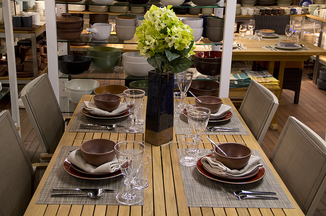
We created this setting on the
Barlow Tyrie Aura Aluminum Rectangular Dining Table
, which was accompanied by four
Barlow Tyrie Aura Stacking Armchairs
.

Weekly Table Setting: Moody Hues and Neutral Accents
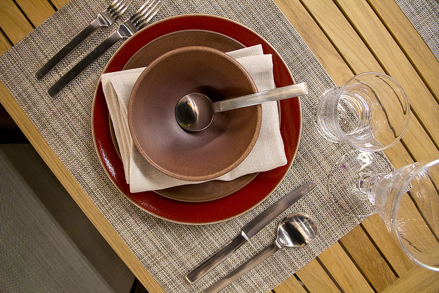
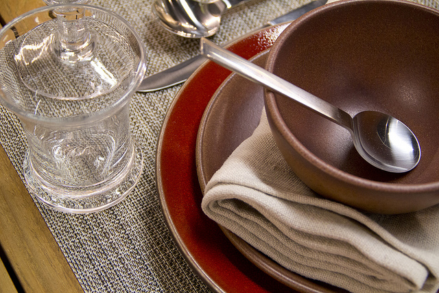
The "moody" place settings consisted of a trio of pieces - the
Jars Ceramics Tourron Dinner Plate
in Cherry, the
Heath Ceramics Coupe Salad Plate
in Redwood, and the
Heath Ceramics Coupe Cereal Bowl
in Redwood. These were all set atop the neutral
Chilewich Basketweave Rectangular Placemat
in Soapstone.
Weekly Table Setting: Moody Hues and Neutral Accents
Nestled between the salad plate and the bowl was a
Libeco Home Napoli Vintage Linen Napkins
in Natural. We used the very sophisticated
which has a lovely satin finish.

Weekly Table Setting: Moody Hues and Neutral Accents
Both glasses hailed from Simon Pearce - we included the shorter
, and the taller, more stately
. Though exuding completely different profiles, and coming from two different collections, they actually worked very nicely together.

Weekly Table Setting: Moody Hues and Neutral Accents
The statuesque vase in the center of the table was a
Jars ceramics Karo Vase
in Indigo. With it's very dark, rich color, it stood out but in a subtle way. I think it really set the tone for the whole table in union with the dinnerware pieces, and helped to creative a cohesive setting.