Design Home Review: Kitchen Tableware

Each year, Boston Magazine constructs a spectacular new home for their Design Home promotion, which is put together piece by piece by a great group of local contractors, designers and businesses alike. The home is erected in a hand-picked location, and once finished gets filled with merchandise from businesses in and around the city. It serves as a fantastic promotional opportunity for the magazine and businesses involved, before it ultimately becomes some very lucky person's home. This past fall, Didriks was lucky enough to participate in the 2012 Design Home. We contributed merchandise to several spaces, including the kitchen,butler's pantry, dining room, enclosed porch, front entryway, back deck, and master bedroom deck. With the holiday season behind us, we wanted to take a peek back at the Design Home, and share some of our favorite images from the home with you! The house came together beautifully, and it was really rewarding to see all of our merchandise sprucing it up.
In the kitchen, we contributed both cookware and tableware. Today, we'll just focus on the tableware, which hailed largely from the Heath Ceramics collection.
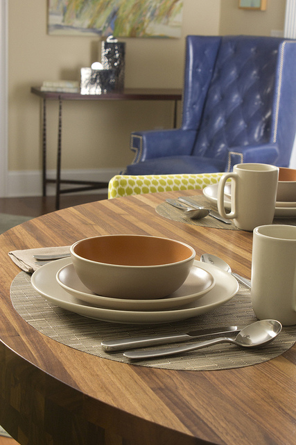
The dinnerware came from, the Heath Coupe collection, and is shone here in French Grey and Linen. Each of the four places we set at the stunning butcher block kitchen island included a dinner plate, a salad plate, and a cereal bowl, as well as a large mug.
The placemats came from the Chilewich Bamboo collection - they were the oval shape in the color Dune. They paired beautifully with the Heath dinnerware, and gave a really warm feel to the settings.
The napkins came from our Libeco Home belgian linen line. We chose the Napoli Vintage napkins, in the color Arabica. They stayed true to the natural-tones theme we picked for the kitchen tableware. The dinnerware was by David Mellor, the Chelsea six-piece collection, from which we pulled the dessert fork, table fork, table knife and soup spoon.
We also used a couple of Heath Ceramics accent pieces to round out the settings, including this salt and pepper set in Aqua, and this Vegetable Bowl in Aqua/Turquoise.
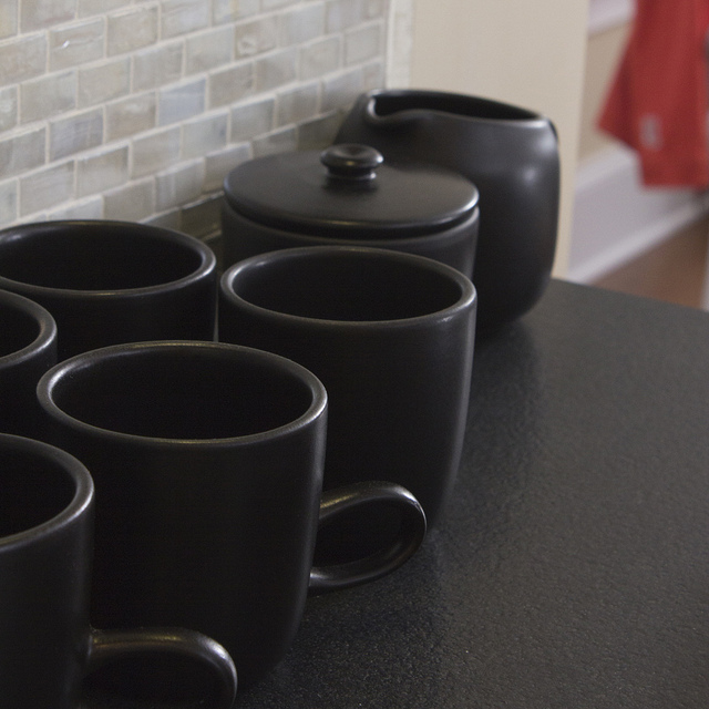
On the counter-top and shelving units around the kitchen, we included other necessary home items. Below, the Heath Ceramics Studio mugs, creamer, and sugar bowl added a bit of subtle flair.
On the white shelves, the iittala Kartio Large Tumblers added a wonderful pop of color.
Each of the pieces in the kitchen shone brightly on it's own, and also worked harmoniously to make it feel cohesive and inviting. This was my favorite room of the house, both for functionality and for aesthetics - but I'm a bit partial to the kitchen so you'll have to see what the other rooms look like to form your own opinion! We'll be sharing those in the days to come, so stay tuned!


